12 Exterior Color Palette Ideas That Instantly Elevate Your Home’s Curb Appeal
Choosing exterior colors is one of those decisions that feels exciting until you realize how permanent it is. Interior paint can be changed on a random weekend, but exterior color lives with you for years. It faces harsh sunlight, rainy days, shadows from trees, and opinions from everyone who walks past your house. That is why exterior color choices are not just about liking a shade. They are about how that shade behaves in real life, in real weather, and next to real surroundings. When done right, exterior color creates confidence. When done wrong, it creates regret.
The best Exterior Color Palette Ideas are never about one color alone. They are about relationships. The main wall color, the trim, the accents, and even the roof all work together like a team. A good palette supports the architecture instead of fighting it. It makes a small home feel intentional and a large home feel welcoming. Most importantly, it ages well. In this guide, we are going deep into palettes that actually work, not just look good on a paint chip. These ideas are designed to help you choose with clarity, confidence, and long-term satisfaction.
1. Warm White, Soft Gray, and Natural Wood
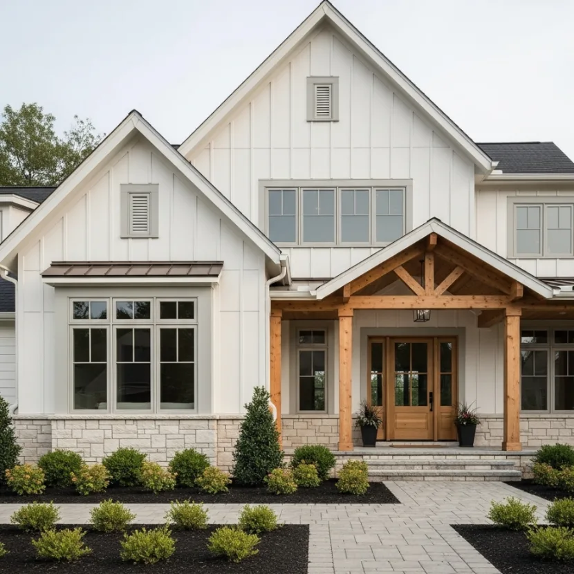
This palette is a classic for a reason and continues to be one of the most reliable Exterior Color Palette Ideas. Warm white creates a clean and welcoming base without feeling harsh or sterile. Soft gray adds contrast and structure, while natural wood brings warmth and texture that paint alone cannot provide. Together, these elements create a balanced exterior that feels fresh yet timeless.
Imagine a suburban or farmhouse-style home with creamy white siding, soft gray trim around windows and doors, and a natural wood front door or beams. The house immediately feels calm and intentional. The white reflects light beautifully, the gray keeps it grounded, and the wood adds personality. This combination works especially well in neighborhoods where you want to stand out subtly without shouting for attention.
Styling flexibility is one of the strongest advantages here. You can lean modern by keeping the wood minimal and lines clean, or go rustic by adding more wood features like shutters or pergola beams. Seasonal decor looks great against this neutral backdrop, making it easy to refresh your exterior without repainting.
A common mistake is choosing a white that is too cool, which can look flat or bluish in sunlight. Another issue is using gray that is too dark, which can overpower the softness of the white and make the home feel heavy.
2. Charcoal Gray, Crisp White, and Matte Black
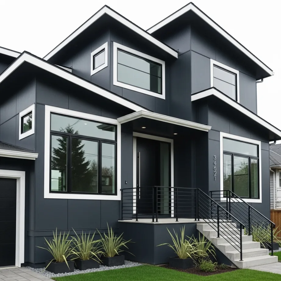
For homeowners who want a bold and modern look, this palette delivers confidence. Charcoal gray adds drama and depth, crisp white keeps the design sharp, and matte black adds a sleek architectural edge. This is one of the more striking Exterior Color Palette Ideas and works best on modern or contemporary homes.
Picture a home with charcoal gray siding, white trim outlining the windows, and black accents on railings, doors, or light fixtures. The contrast feels intentional and polished. The house looks strong, grounded, and high-end without relying on bright colors.
Styling flexibility comes from how much black you introduce. Minimal black feels refined, while heavier use feels more industrial. You can also soften the look with landscaping, greenery, or warm lighting to balance the darker tones.
A common mistake is using flat charcoal without texture, which can feel lifeless. Another issue is skipping proper lighting, which makes dark exteriors feel uninviting at night.
3. Beige, Cream, and Warm Brown
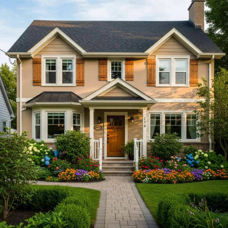
This palette leans into warmth and comfort, making it ideal for traditional or family-oriented homes. Beige provides a soft neutral base, cream lightens the overall look, and warm brown adds richness. Among Exterior Color Palette Ideas, this one feels especially welcoming.
Imagine a home with beige walls, cream trim, and brown shutters or a wooden door. The colors blend seamlessly with natural surroundings like trees and gardens. The house feels approachable and lived-in rather than overly styled.
Styling flexibility is high because these tones work well with brick, stone, and landscaping. You can introduce subtle accents through lighting or hardware without disrupting the harmony.
A common mistake is choosing beige with strong yellow undertones, which can look dated. Another issue is not enough contrast, which can make the home look flat.
4. Navy Blue, Bright White, and Brass Accents
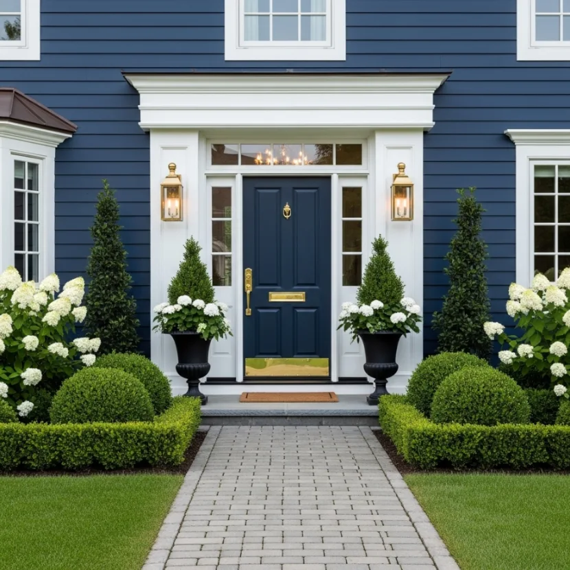
Navy blue has become a favorite in Exterior Color Palette Ideas because it feels bold yet classic. Paired with bright white trim, it creates strong contrast, while brass or gold accents add a touch of elegance.
Picture a navy-painted home with crisp white window frames and a brass door handle or light fixtures. The color feels rich and confident without being overwhelming. It works beautifully in coastal, colonial, or modern styles.
Styling flexibility comes from accents. You can lean coastal with light landscaping or more formal with structured hedges and symmetrical details. Navy adapts surprisingly well.
A common mistake is choosing navy that is too dark, making the house look almost black. Another issue is neglecting maintenance, as darker colors show wear more easily.
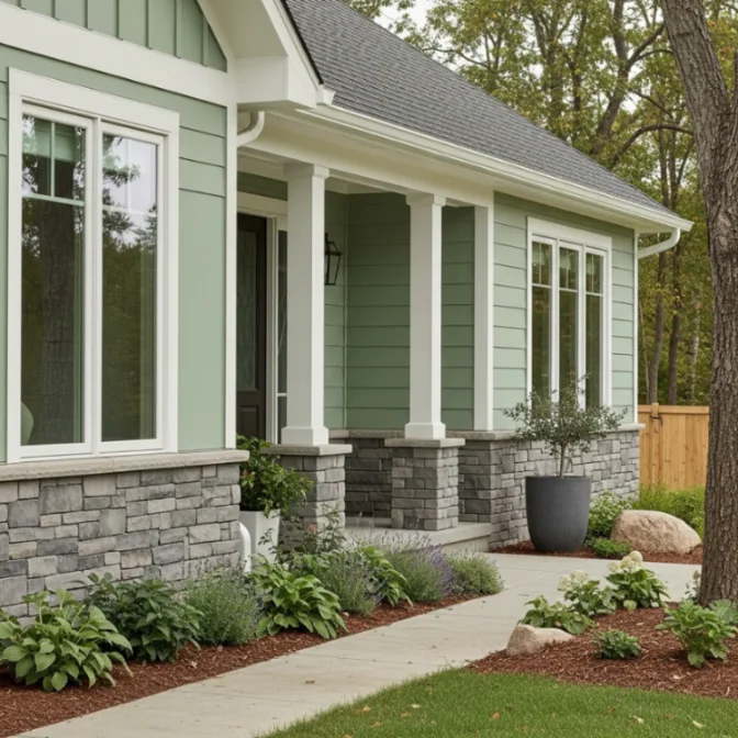
5. Sage Green, Soft White, and Stone Gray
Sage green brings calm and nature into exterior design. It is one of the most soothing Exterior Color Palette Ideas and works beautifully in both urban and rural settings. Soft white brightens the look, while stone gray adds grounding.
Imagine a home surrounded by greenery, painted in sage with white trim and gray stone elements. The house blends into the landscape rather than fighting it. It feels peaceful and intentional.
Styling flexibility is strong. Sage works with wood, stone, and metal accents. You can adjust the look by changing trim brightness or landscaping style.
A common mistake is choosing green that is too saturated. Another issue is pairing sage with cool grays that clash with its warmth.
6. Light Gray, White, and Charcoal Accents
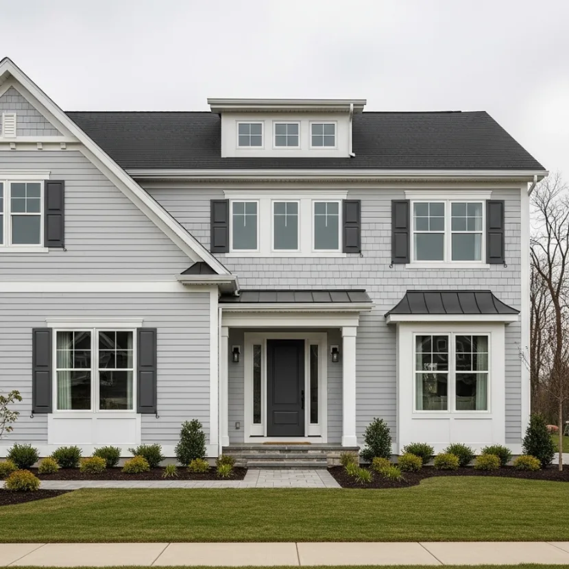
Light gray is a safe yet modern choice in Exterior Color Palette Ideas. It provides neutrality without feeling bland. White trim keeps it clean, while charcoal accents add depth.
Picture a light gray home with white trim and dark gray shutters or roof. The contrast feels balanced and versatile. It works in almost any neighborhood.
Styling flexibility is excellent. This palette supports modern, traditional, or transitional styles. Decor and landscaping can shift without repainting.
A common mistake is using gray that looks blue in sunlight. Another issue is not testing samples in different lighting conditions.
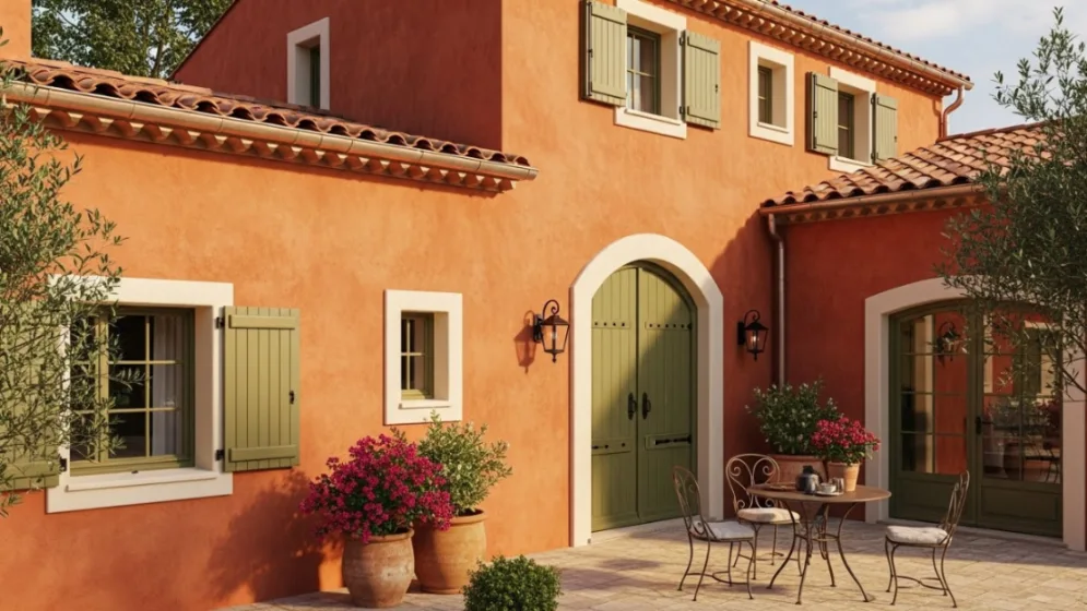
7. Terracotta, Cream, and Olive Green
For a warm, earthy feel, this palette brings personality. Terracotta adds richness, cream softens it, and olive green grounds the design. It is one of the more character-driven Exterior Color Palette Ideas.
Imagine a home with terracotta walls, cream trim, and olive shutters. The look feels Mediterranean and inviting. It works especially well in sunny climates.
Styling flexibility comes from textures like tile or stone. Plants enhance the warmth naturally.
A common mistake is overusing terracotta, making the home feel heavy. Another issue is clashing roof colors.

8. Black, White, and Natural Wood
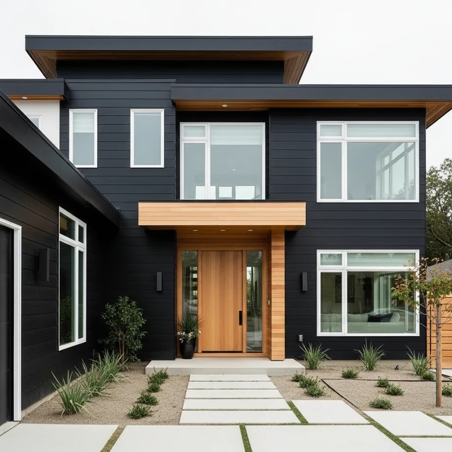
This high-contrast palette feels modern and architectural. Black walls create drama, white trim defines structure, and wood softens the look. It is one of the boldest Exterior Color Palette Ideas.
Picture a modern home with black siding, white window frames, and a wooden front door. The contrast feels intentional and striking.
Styling flexibility depends on balance. Wood elements prevent the look from feeling cold. Lighting and landscaping are essential.
A common mistake is using pure black without texture. Another issue is poor maintenance planning.
9. Soft Blue, White, and Light Gray
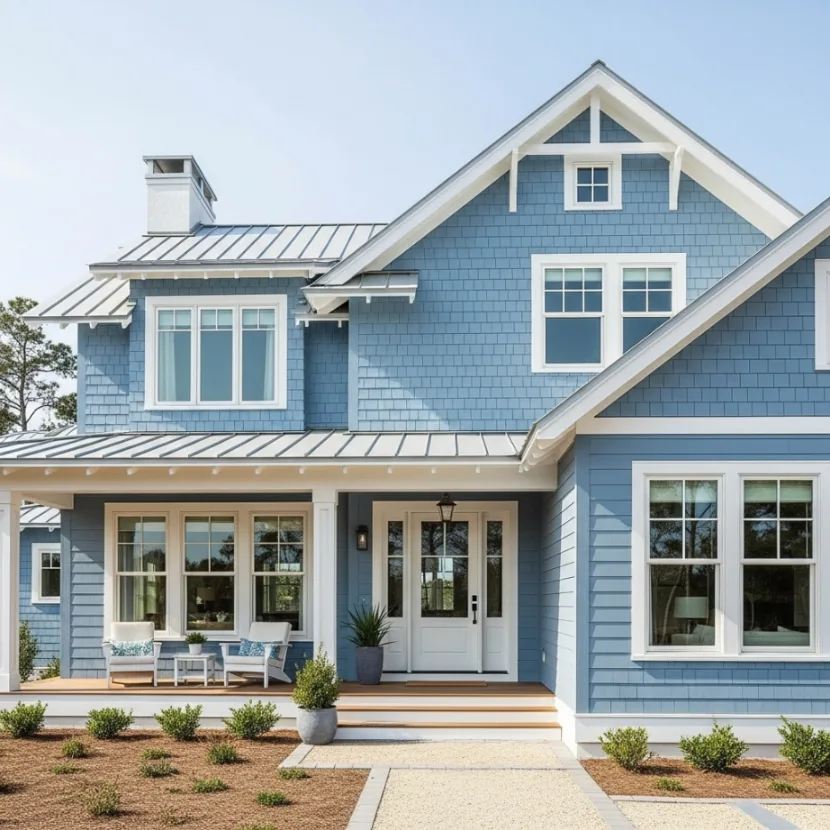
Soft blue creates a calm, friendly exterior. Paired with white and light gray, it feels airy and relaxed. This is one of the more approachable Exterior Color Palette Ideas.
Imagine a coastal-style home painted in soft blue with white trim. The house feels breezy and welcoming.
Styling flexibility is high. This palette works with many roof colors and landscaping styles. A common mistake is choosing blue that is too pastel. Another issue is not enough contrast.
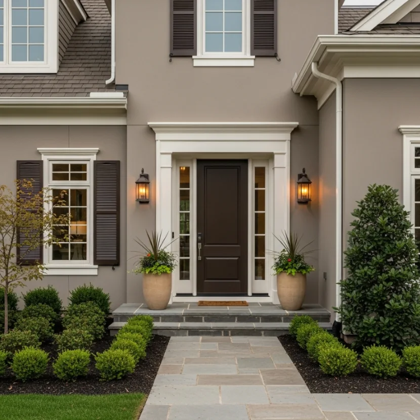
10. Taupe, Cream, and Dark Brown
Taupe offers warmth without heaviness. Cream brightens it, and dark brown adds depth. This palette feels refined and timeless.
Picture a home with taupe walls, cream trim, and brown accents. It feels elegant without being flashy.
Styling flexibility comes from adjusting accent intensity. Landscaping enhances the warmth. A common mistake is choosing taupe that leans purple. Another issue is insufficient lighting.
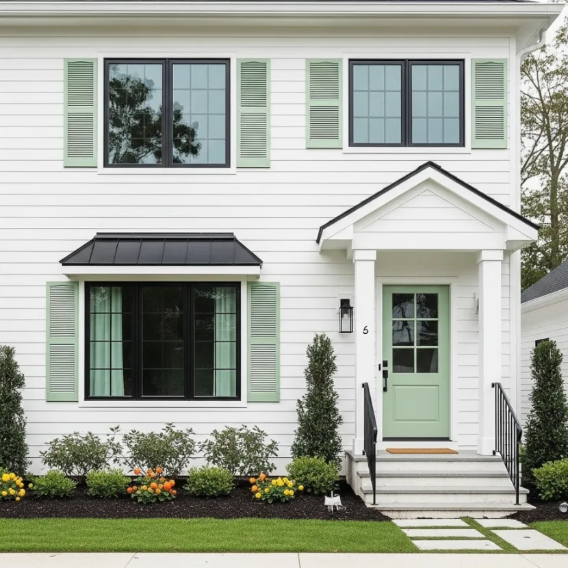
11. White, Black, and Soft Green
This palette feels fresh and modern with a hint of nature. White dominates, black adds contrast, and green softens the look.
Imagine a white home with black trim and green shutters. The balance feels lively and clean.
Styling flexibility is strong. Green accents can change seasonally. A common mistake is too much black. Another issue is poor proportion planning.
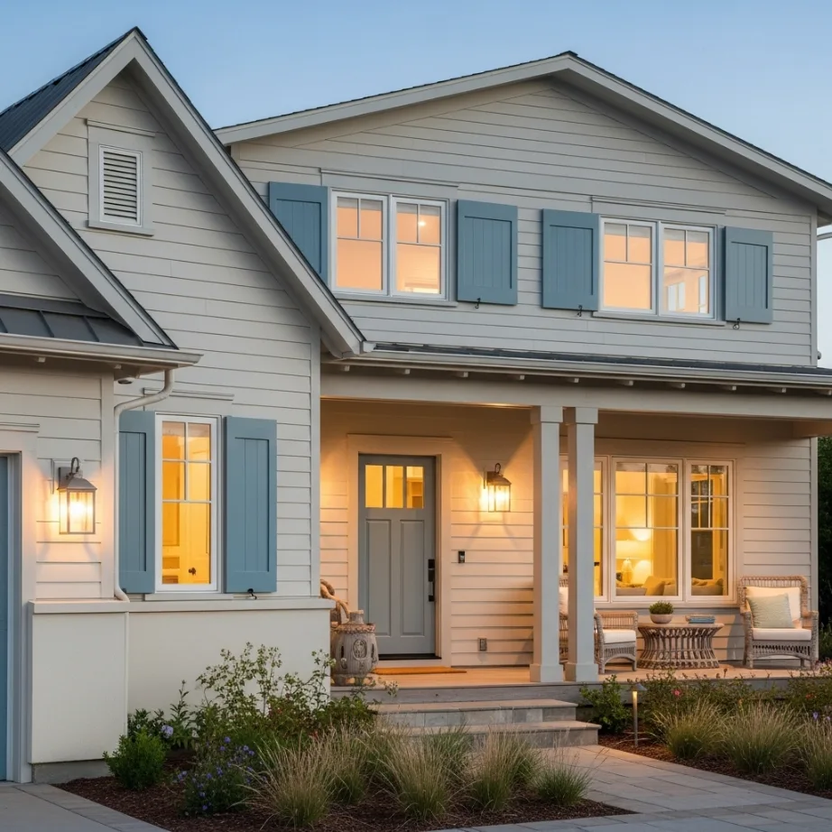
12. Sand, Warm Gray, and Muted Blue
This palette feels coastal yet grounded. Sand tones warm the exterior, gray adds balance, and blue brings subtle color.
Picture a beach-adjacent home with sand-colored walls and blue accents. It feels relaxed and timeless.
Styling flexibility is excellent. This palette adapts to different architectural styles. A common mistake is choosing blue that is too bright. Another issue is ignoring roof color compatibility.
FAQs
1. How many colors should an exterior palette have
Most homes look best with three main colors.
2. Do exterior colors fade over time
Yes, especially darker shades in strong sunlight.
3. Should trim always be lighter than walls
Not always, but contrast is important.
4. Can I use bold colors on small homes
Yes, with balanced accents.
5. How do I test exterior paint colors properly
Always test large samples in different lighting conditions.