12 Minimalist Reading Nook Ideas for Small Spaces to Curate Your High-End Literary Retreat
Think about your home for a second. Is there a random corner or a weird alcove that is currently just a “junk zone” for half-empty boxes and dusty shoes? I once lived in a studio where my reading nook was just me sitting on a hard wooden floor leaning against a radiator, and let me tell you, it felt more like a punishment than a luxury. IMO, the minimalist reading nook is the ultimate design flex because it proves you can engineer a five-star sanctuary in a footprint smaller than a bathmat. You do not need a sprawling Victorian library to host a professional-grade reading session; you just need to stop seeing your small corners as wasted space and start treating them like a curated boutique gallery.
I have spent a significant amount of time dissecting high-end urban floor plans to figure out how the pros create that “mighty” retreat feel without the clutter of traditional furniture. The secret is moving away from bulky, overstuffed armchairs and starting to curate layers of floating geometry, integrated lighting, and high-transparency materials. Whether you are working with a narrow hallway, a window bay, or a tiny spot behind the sofa, these ideas are designed to be high-impact, easy to follow, and aesthetically stunning. We are going to find a home for everything from “ghost” chairs to architectural ledges while making your entire interior look like a masterpiece of efficiency. Ready to turn that “empty spot” into a sanctuary of style? Let us dive into these twelve secrets.
1. The Cantilevered Floating Ledge
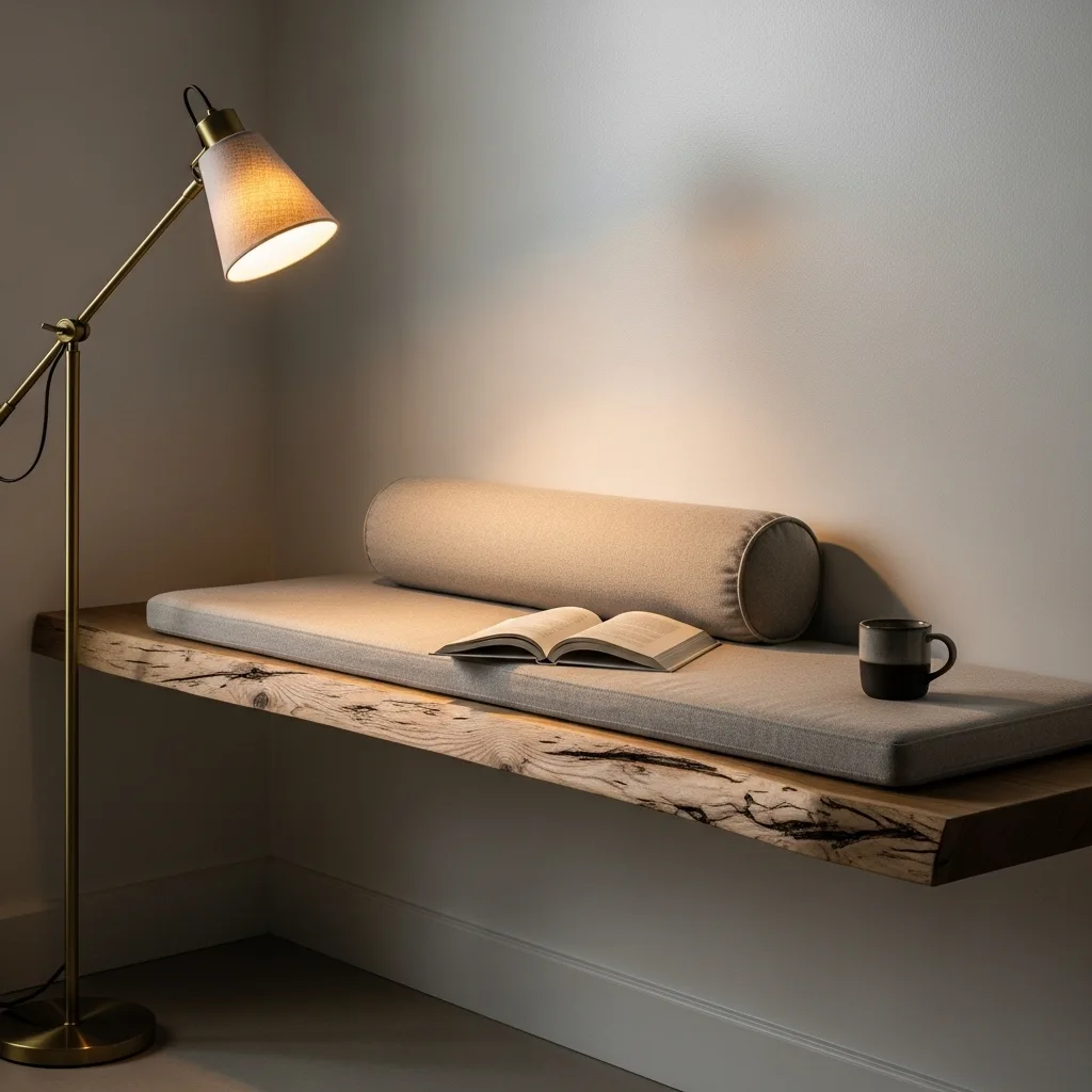
If you are fighting for every square inch of floor space, you need to ditch the furniture legs and look at your walls. I suggest installing a thick, cantilevered wooden ledge—specifically in a high-end wood like white oak—to act as an “instant” bench. When you can see the floor extend all the way to the wall under your seat, your brain perceives the room as much larger and more airy. It is a simple psychological trick that adds a layer of modern geometry and comfort to your daily routine.
Floating ledges add a touch of “Manhattan-loft” elegance that feels very curated and expensive to the eye. To keep it feeling luxury, pair the ledge with a custom-made, slim-profile cushion in a neutral linen fabric. This keeps the “visual weight” of the nook very light and manageable for a professional-grade look across the entire room. It signals that your property was designed with a professional-grade eye for clean lines and structural integrity.
I personally love how a floating ledge can disappear into the architecture when not in use. This tiny bit of extra engineering creates an illusion of depth that makes your living area feel twice as large as it actually is. FYI, this ledge can also double as a high-end plant shelf or a display for your favorite art books. 🙂 It turns a basic wall into a sophisticated piece of luxury storytelling that greets you every afternoon.
2. The Transparent “Ghost” Chair Nook
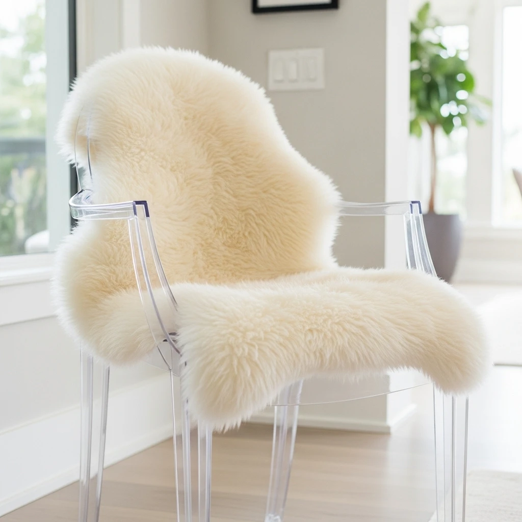
Visual clutter is the enemy of a small space, and a heavy, dark chair can act like a wall that closes in on you. I suggest using a transparent “ghost” chair—a high-quality acrylic armchair—to define your reading zone without blocking the view of the room. Because the chair is clear, it maintains the open flow of the floor plan while still providing a professional-grade spot for your intellectual sessions. It is a sophisticated way to manage a tight footprint with a professional-grade aesthetic.
Ghost chairs add a touch of “Parisian-chic” elegance that feels very curated and expensive to have in a modern home. To keep it feeling luxury, drape a high-end sheepskin rug or a mohair throw over the seat to add a layer of organic texture and warmth. This keeps the visual noise to a minimum while providing a stunning focal point for the corner. It signals that you appreciate the fine details of professional interior design without needing to overcrowd the room.
I find that a transparent chair makes even the darkest corner feel more energized and vibrant. It provides everything you need for a curated, high-end look that feels very intentional and expensive. :/ It is a smart move that signals a high-end, carefully planned environment for your solo time. This approach ensures your sanctuary stays vibrant and functional without the tech or furniture dominating the space.
3. Recessed “Negative Space” Shelving
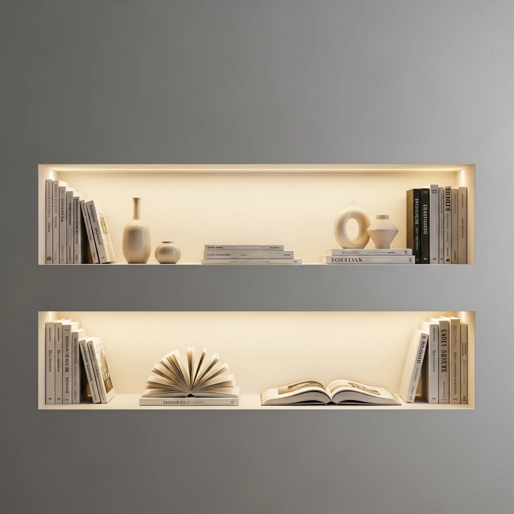
In a small minimalist home, bulky, freestanding bookcases are a total mood-killer for a high-end floor plan. I suggest creating recessed “negative space” shelving by carving out a shallow niche directly into your drywall to host your books. This allows your library to sit flush with the wall, keeping your pathways clear and your visual lines clean. It is a sophisticated way to add a layer of luxury and depth to your house design without losing an inch of floor space.
Recessed shelves add a touch of “stately-home” gallery elegance that feels very curated and expensive to experience every day. To keep it feeling luxury, use integrated LED “wash” lighting inside the niche to highlight the textures of your book spines at night. It adds a layer of luxury storytelling that tells everyone you value the small details that make a space feel “mighty” and lived-in. It turns a functional wall into a professional-grade design statement.
I personally love how a recessed shelf makes the wall look like a piece of functional art rather than just a storage unit. It provides a sense of modern geometry and comfort that is impossible to achieve with standard bookcases. FYI, you can also paint the interior of the niche a slightly darker tone to add an illusion of extra depth. 🙂 It is a functional detail that signals a carefully curated and expensive taste.
4. The Monochromatic “Color Drench” Corner
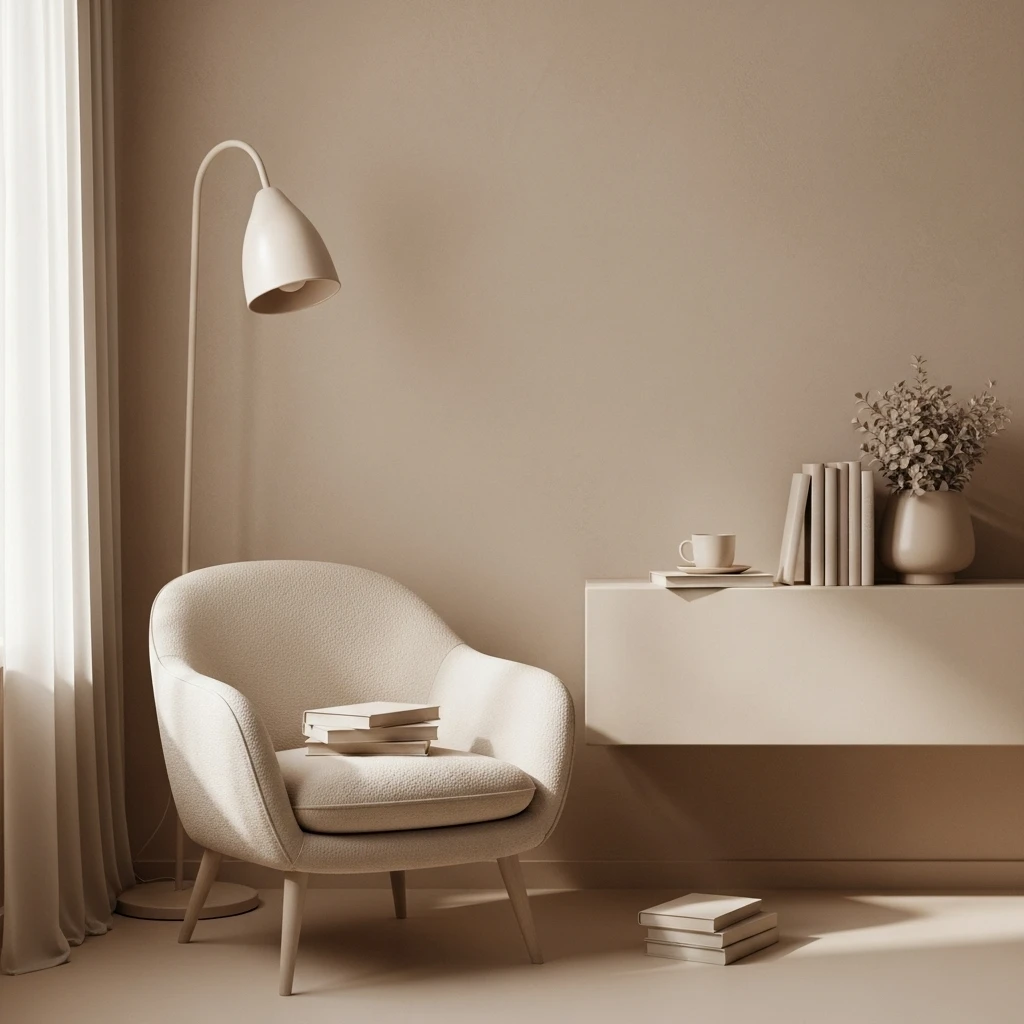
One of the easiest ways to make a small nook look high-end and professional is to eliminate the visual boundaries between the furniture and the wall. I suggest choosing a monochromatic “color drench” for the nook—painting the wall, the shelf, and even the chair in the exact same shade of soft grey or beige. This creates a clean, sophisticated look that makes the corner feel much more expansive, calm, and expensive. It is a smart way to maximize your visual appeal while keeping the room looking grand and intentional.
Monochromatic zoning adds a touch of “boutique-hotel” elegance that feels very curated and intentional to the eye. To keep it feeling luxury, use a variety of finishes—like matte on the walls and a high-gloss on the shelving—to keep the look from becoming flat or boring. It adds a layer of luxury storytelling that tells everyone you appreciate the fine details of professional interior design. It turns a simple color choice into a masterpiece of home design.
I find that a monochromatic room makes the entire reading experience feel much more peaceful and less chaotic. It provides everything you need for a curated, high-end look that feels very intentional and expensive. FYI, this technique is very popular in luxury home staging because it makes the house look like a work of art. 🙂 It is a functional detail that signals a carefully curated and expensive taste.
5. Single-Stem Vertical Lighting
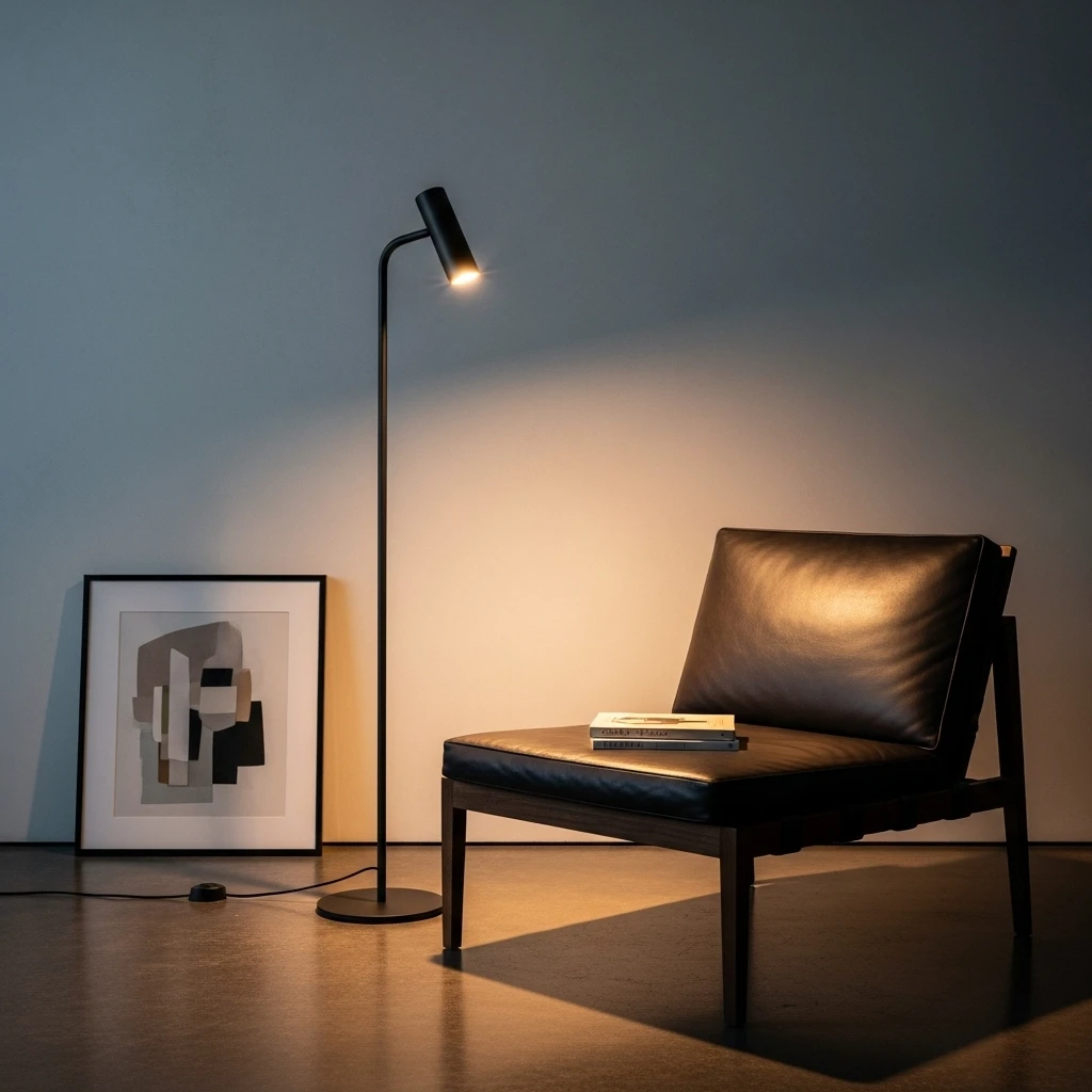
In a tiny nook, a traditional floor lamp with a wide base can act like a wall, blocking your movement and taking up valuable “foot” space. I suggest installing a single-stem, minimalist vertical floor lamp or a wall-mounted swing-arm sconce specifically over your seat. This provides a professional-grade light source for reading while keeping your floor and side tables completely clear. It is a sophisticated way to gain focus without cluttering your precious square footage.
Minimalist lighting adds a touch of high-tech, “private-club” elegance that signals your home is a permanent and well-cared-for sanctuary. To keep it feeling luxury, choose a finish like brushed brass or matte black that matches your room’s hardware and other light fixtures. It provides everything you need for a high-end atmosphere that feels both safe and beautiful. It turns a basic utility into a professional-grade architectural feature.
I find that the focused beam of a sleek sconce makes the entire reading experience feel much more intentional and peaceful. It provides a sense of modern geometry and comfort that is impossible to achieve with standard, bulky lamps. :/ It is a smart move that turns a standard corner into a sanctuary of style. This lighting choice tells everyone you are not afraid to be bold with your design.
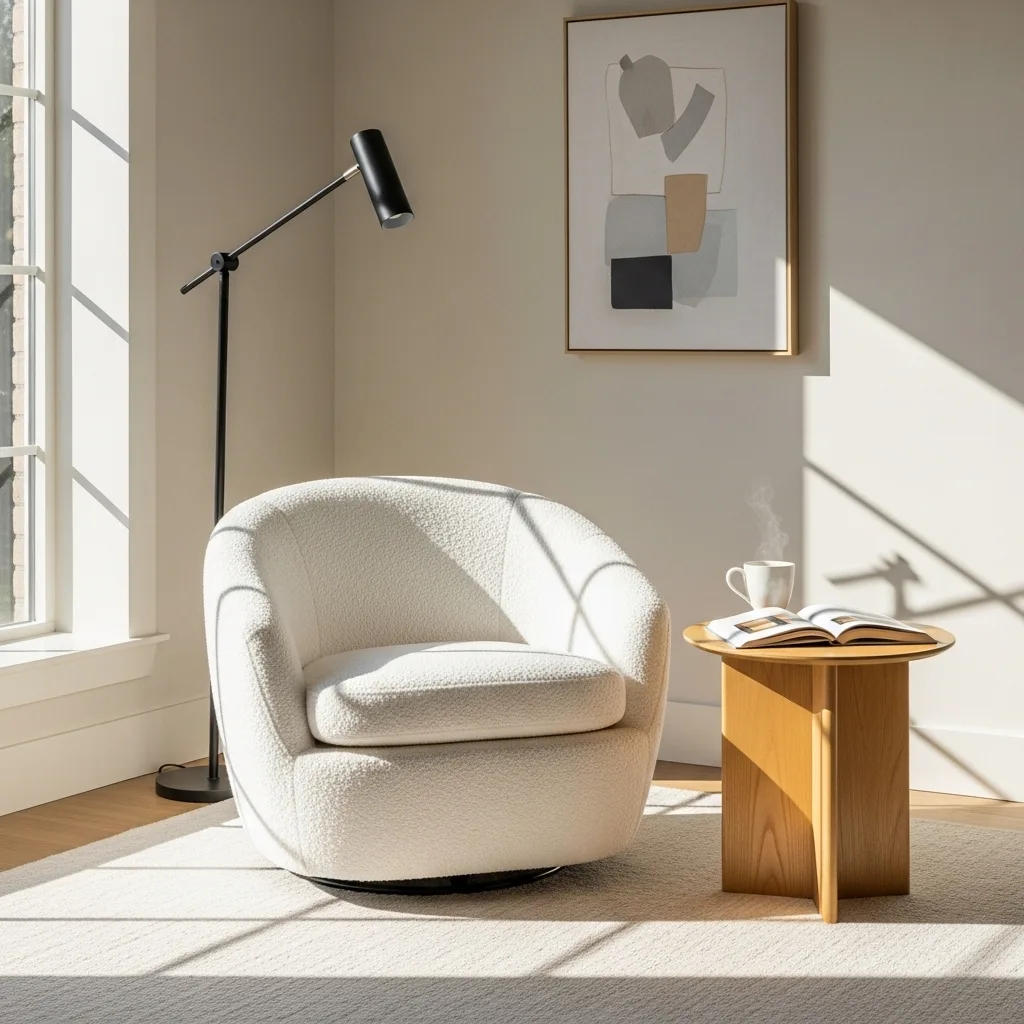
6. The Sculptural Swivel “Pod” Chair
If your space is awkwardly shaped, you need a piece of furniture that creates its own sense of geometry and purpose. I suggest using a single, iconic curved “pod” or swivel chair to define your reading nook without needing extra side tables. The organic, rounded lines of a curved chair provide a beautiful contrast to the sharp corners of a small room, making the area feel more inviting and soft. It is a sophisticated way to gain focus while maintaining a high-end look.
Swivel chairs add a touch of mid-century, “executive-suite” elegance that feels very curated and expensive to the eye. To keep it feeling luxury, choose a chair in a high-texture fabric like bouclé or a structured wool to add a layer of warmth. It adds a layer of luxury storytelling that tells everyone you appreciate the mix of the invisible and the tactile in design. It turns a functional seat into a professional-grade design statement.
I find that a swivel chair is particularly “mighty” in a small space because it allows you to rotate toward the window for light or toward the room for conversation. It provides everything you need for a curated, high-end look that feels very intentional and expensive. FYI, these chairs often have a built-in “hug” feeling that makes you feel shielded from the rest of the house. 🙂 It is a functional detail that signals a carefully curated and expensive taste.
7. Floating Glass Display Shelves
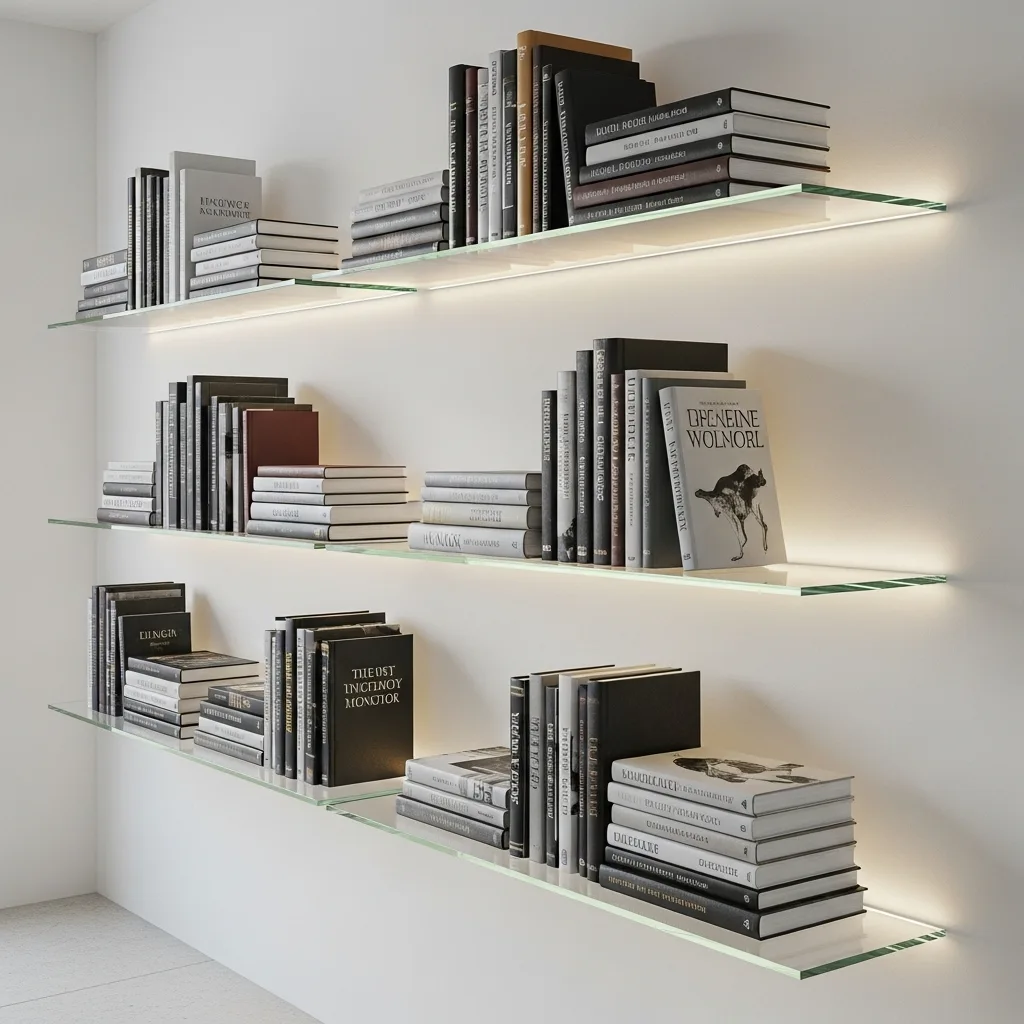
If your reading nook is in a dark hallway or a tiny room, solid wood shelves can make the walls feel like they are closing in on you. I suggest using thin, floating glass shelves to hold your books and curated artifacts. Glass shelves allow light to pass through them, making the “visual weight” of your collection almost invisible and keeping the space airy. It is a sophisticated way to add a layer of luxury and depth to your house design.
Glass display shelves add a touch of “executive-suite” elegance that feels very curated and intentional to the eye. To keep it feeling luxury, integrate small LED “puck” lights into the wall above the shelves to highlight each individual item. It adds a layer of luxury storytelling that tells everyone you value the small details that make a space feel “mighty” and lived-in. It turns a functional wall into a professional-grade design statement.
I find that glass shelves make the entire reading area feel much more grand and “mighty” by giving the room a defined “gallery” look. It provides a sense of modern geometry and comfort that makes the entire space feel more inviting and warm. :/ It is a smart move that signals a high-end, carefully planned environment. This approach ensures your sanctuary stays vibrant and functional for every afternoon social.
8. Integrated Botanical Ledges
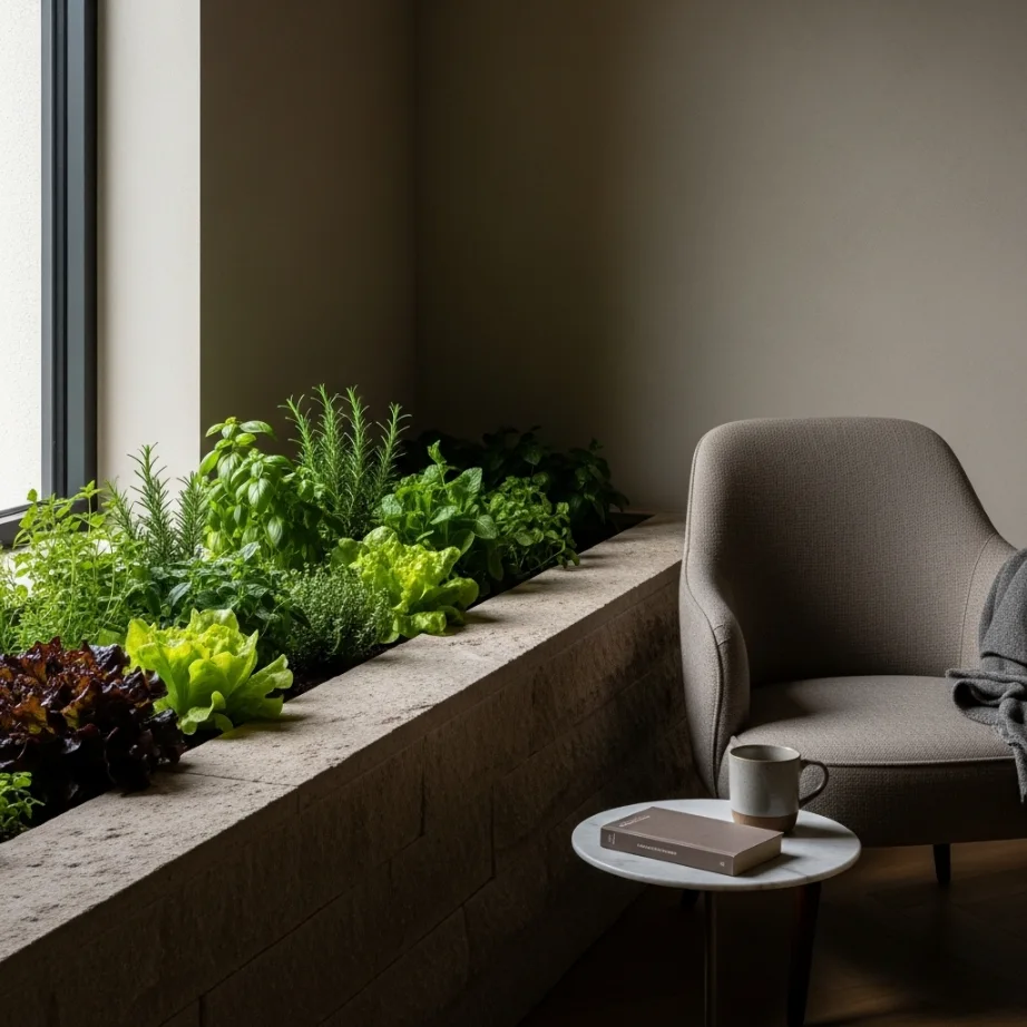
Nothing makes a minimalist reading nook feel more alive and high-end than a bit of greenery integrated directly into the architecture. I suggest creating a built-in planter box or a dedicated “green nook” right into your floating bench or shelving unit. This frames the workspace and creates a natural “cocoon” that makes the nook feel more vibrant and energized. It is a sophisticated way to bring the “outside in” and boost your mood while you read.
Botanical ledges add a touch of exotic, “cool” elegance that feels very curated and expensive to experience during the day. To keep it feeling luxury, use a high-quality stone liner for the planter that matches your flooring or countertops. It adds a layer of luxury storytelling that tells everyone you value health and organic beauty. It turns a boring workspace into a professional-grade botanical sanctuary.
I personally suggest using a “cross-lighting” technique where you hit the plants with a soft spotlight from a low angle at night. This casts beautiful shadows on the walls and makes the kitchen feel like a high-end hotel lounge. :/ It is a smart move that signals a carefully planned use of light and nature. This approach ensures your sanctuary stays cozy and functional for every morning arrival.
9. The Mirrored Corner Illusion
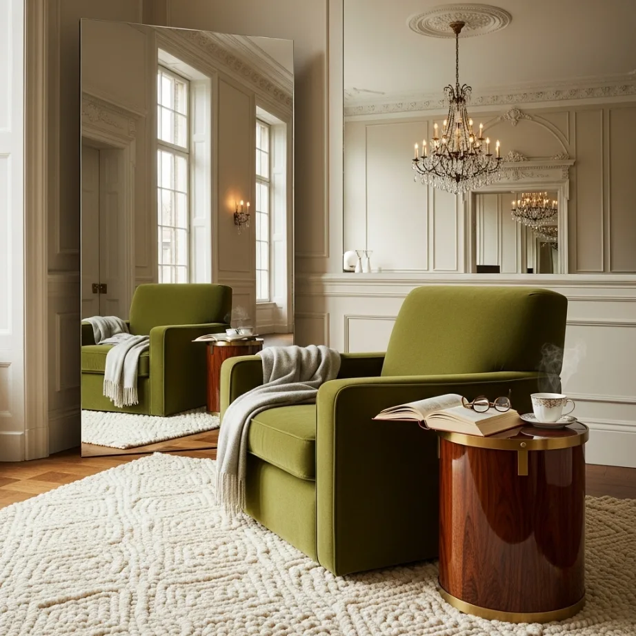
Lighting and depth are everything in a small space, and mirrors are the best tool to double the impact of your reading nook. I suggest mounting an oversized, frameless mirror on the wall behind your chair to reflect the light and the rest of the room. This technique does not just add light; it creates a “window” effect that makes your reading corner feel twice as deep as it really is. It is a classic design move that adds instant depth and a touch of luxury drama.
The mirror reflects the incoming sunlight, which actually helps the entire room feel more energizing and vibrant during the day. To keep it feeling luxury, choose a mirror with a high-end antique bronze or smoked finish to add a layer of sophisticated texture. It is a smart way to optimize your space and create a brighter environment for social gatherings or afternoon reading. It acts as a powerful focal point that anchors the entire seating zone.
I personally love how a mirror can catch the glow of your reading lamp at night, adding a magical ambiance to your sanctuary. It provides everything you need for a high-end, energized nook that feels spacious and open to the rest of the house. FYI, placing the mirror directly across from a window doubles the “view” of the outside from your seat. 🙂 It is a functional detail that signals a carefully curated and expensive taste.
10. Low-Profile Floor Cushion Zones
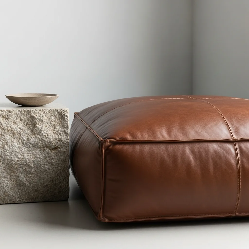
If your space is too tight even for a slim chair, you need to go low-profile to maintain a high-end, “zen-luxe” look. I suggest using a single, oversized floor cushion—specifically one with a structured back and a leather finish—to define your reading zone. When you move the seating to the floor, it creates an immense amount of “air” above you, making the ceiling feel much taller and the room feel grand. It is a sophisticated way to add comfort and utility at the same time.
Structured floor cushions add a touch of modern, “resort-style” elegance that feels very curated and expensive to experience. To keep it feeling luxury, pair the cushion with a very low, minimalist side table made of stone or metal. It adds a layer of luxury storytelling that tells everyone you value the small details that make a space feel “mighty” and lived-in. It turns a functional corner into a professional-grade design statement that anchors the room.
I find that a soft, high-end floor zone is the best way to make a hard stone or tile entrance feel much more private and relaxed. It provides a sense of modern geometry and comfort by giving the eye a “soft” anchor in the middle of the room. :/ It is a smart move that signals a high-end, carefully planned environment. This approach ensures your small sanctuary stays cozy and functional for every guest.
11. Custom Built-in Window Benches
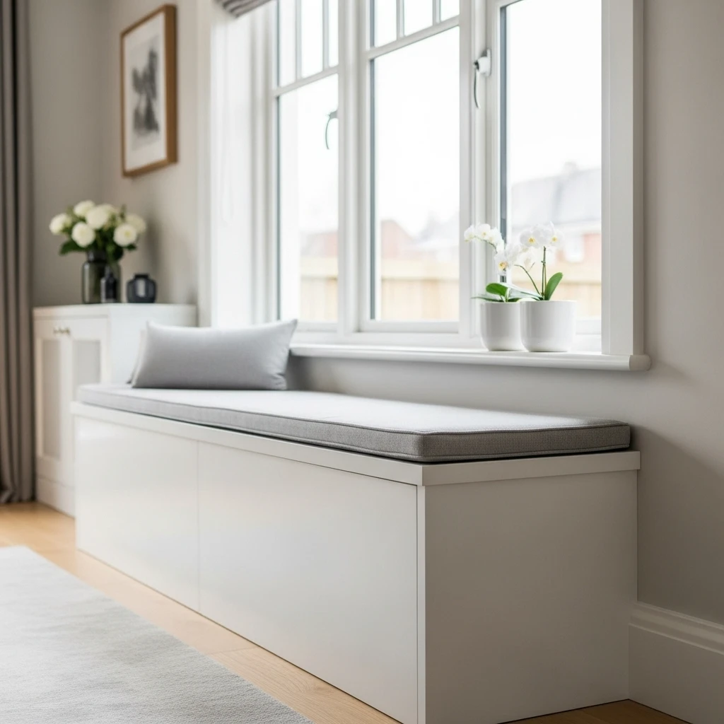
If you have a window, you have a high-end reading nook just waiting to be built into the frame. I suggest installing a custom-fitted window bench that matches your existing cabinetry or wall color exactly. Built-ins feel like a natural part of the house architecture, which makes the nook look much more high-end and permanent. It is a sophisticated way to add a layer of luxury and depth to your house design without losing any floor space.
Window benches add a touch of “boutique-hotel” elegance that signals your home is a permanent and well-cared-for sanctuary. To keep it feeling luxury, top the bench with a high-quality, custom cushion and a single textured throw pillow. It adds a layer of luxury storytelling that makes the room feel like a custom-designed retreat rather than an afterthought. It is a functional detail that signals a high-end, carefully planned use of limited space.
I personally love how a built-in bench connects your sanctuary to the outside world, making it feel less like a “room” and more like a view. It provides everything you need for a curated, high-end look that feels very intentional and expensive to build. FYI, these benches often come with hidden storage underneath for your extra blankets and books! 🙂 It is a functional detail that signals a carefully curated and expensive taste.
12. Floating Metal Corner Shelves
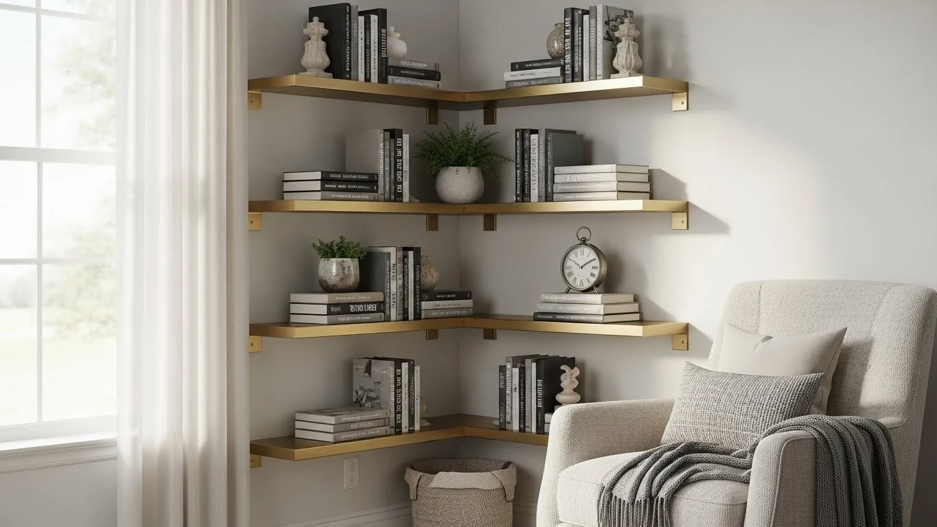
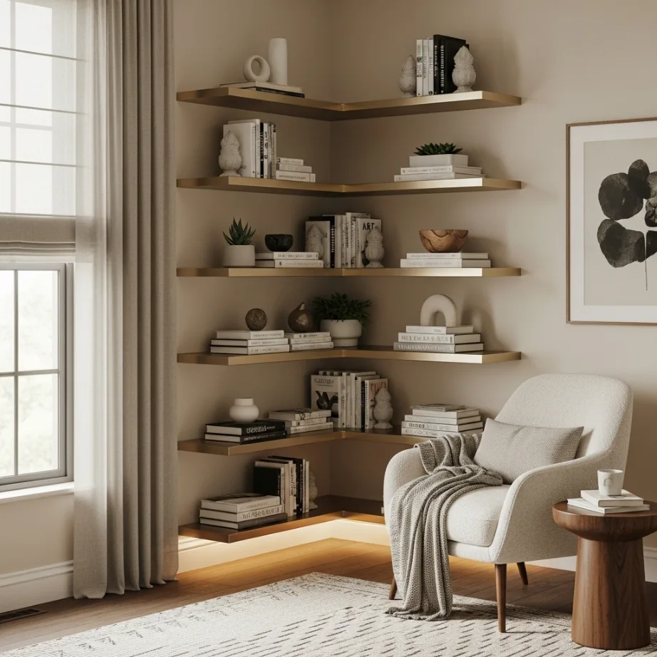
If you have a 90-degree corner that feels a bit dead, you need to stop using traditional furniture that creates “dead” zones. I suggest installing thin, floating metal corner shelves that wrap seamlessly around the angle to hold your current reads. This ensures that you can utilize every single inch of the corner without items getting buried behind each other in the dark. It is a sophisticated way to maintain a luxury look while keeping the area approachable.
Corner shelving units add a touch of modern, “cool” elegance that feels very curated and expensive to the eye. To keep it feeling luxury, choose a design with interesting textures like brushed brass or black steel to match your room’s hardware. It adds a layer of luxury storytelling that tells everyone you appreciate the mix of the visible and the tactile in design. It turns a functional storage tool into a professional-grade design statement.
I find that vertical storage in a corner is the best way to hide the clutter of daily life while still showing off your personality. It provides everything you need for a curated, high-end look that feels very intentional and expensive. :/ It is a smart move that signals a high-end, carefully planned environment. This approach ensures your small sanctuary stays private and functional for every afternoon snack.
Conclusion
Maximizing your minimalist reading nook is all about honoring the space you have while injecting it with your own sense of light and luxury. You have the perfect excuse to go bold with your floating geometry and monochromatic colors because a curated sanctuary is the most flexible tool you have for a happy home. Whether you choose a dramatic cantilevered ledge or a simple transparent ghost chair, the key is to make every choice intentional. Think about how the organizational tools guide your eyes and how the surfaces of your home remain clear for daily movement. Don’t be afraid to start your nook project this weekend and see the difference it makes. Your sanctuary is waiting for its living, breathing, high-end glow-up. Remember, even the smallest corners can have the biggest style. Stay creative and keep making your space yours.
FAQs
- How do I choose the best chair for a small reading nook? You should prioritize low-profile, curved chairs like a swivel armchair or a transparent ghost chair to maintain an airy, high-end feel.
- What is the best lighting for a reading nook in a dark corner? Utilize a minimalist, wall-mounted swing-arm sconce to provide focused light without taking up valuable floor space with a bulky lamp.
- How do I store books in a tiny nook without it looking messy? The secret is to use recessed “negative space” shelving or floating glass shelves to keep the visual weight light and the lines clean.
- Can I create a reading nook if I don’t have an empty room? Yes, I suggest using a window bay, a narrow hallway, or even the space behind your sofa to engineer a “hidden” sanctuary.
- Where should I place a reading nook for the best light? Always prioritize a spot directly under or next to a window to utilize natural light during the day, making the space feel more expansive.